With delicious flapjacks and an appetite to grow, our task was to breathe a new lease of life into this tasty product through positioning, tone of voice and design.
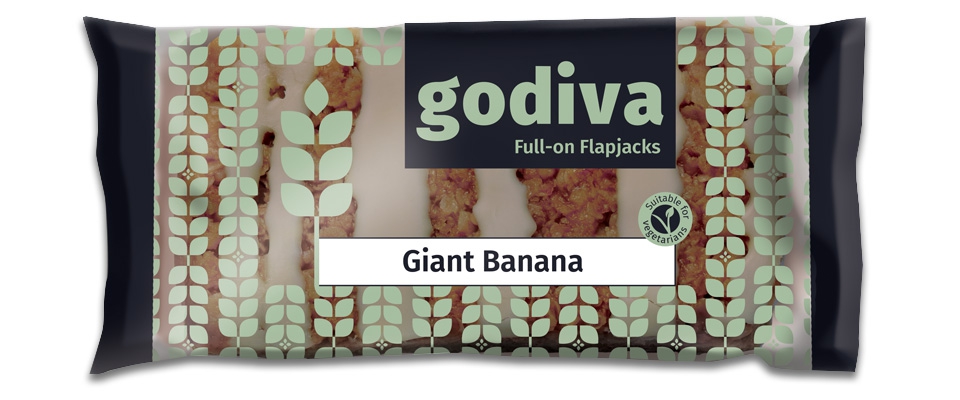
To come up with the brand’s unique selling point we undertook extensive research to understand market scope. It was whilst undertaking crucial extra product research (halfway through a Godiva flapjack) that the creative spark came and the driving force for Godiva’s story ‘full on flapjacks’ burst forth. Full on in flavour and taste, full on in filling you up. A bold typeface with a soft kindness was our rationale for the logo; reflecting the substantial product whilst conveying the company’s friendly personality and family origins.
"From first sight of the design proposal from Gladstone we knew instantly it was what we needed. Apart from the excellent customer service of Gladstone we are particularly pleased to be working with designers with such vision."
Taking inspiration from the substantial bar size and high quality ingredients we pulled the ingredients out visually, using a stylised oat pattern to represent the honest authenticity of the ingredients, making the ingredients feature heavily as heroes.
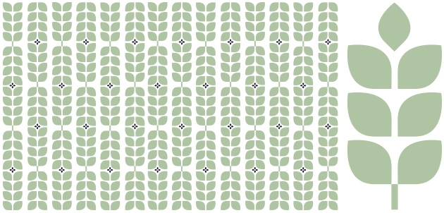
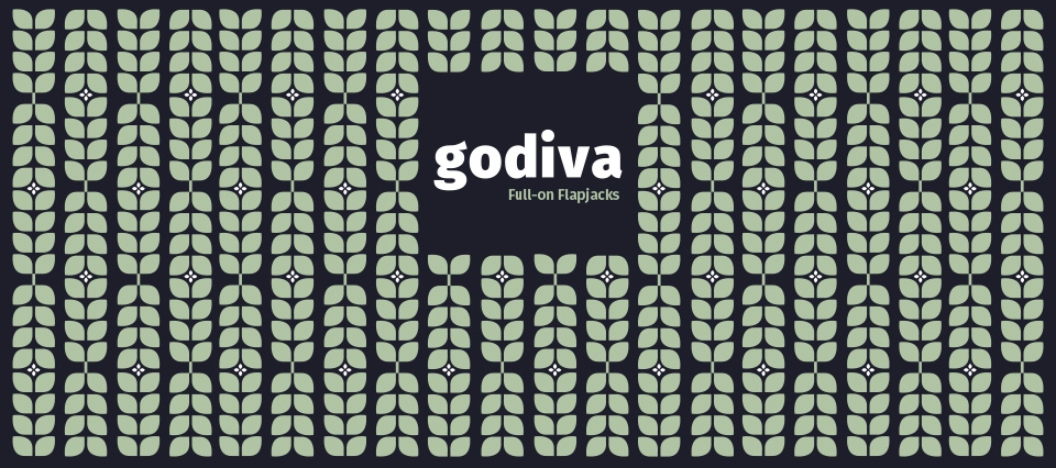
Part of the brief was for the product range to be seen through the packaging, so a bold and distinct colour palette had to stand out against the products within.
Godiva Flapjack Co continues to go from strength to strength. In fact the demand for the deliciously filling flapjacks is such that they are upping production to meet an increasing demand.
Check out some more of our work